

Visual Identity, Web Design, Packaging Design, Art Direction
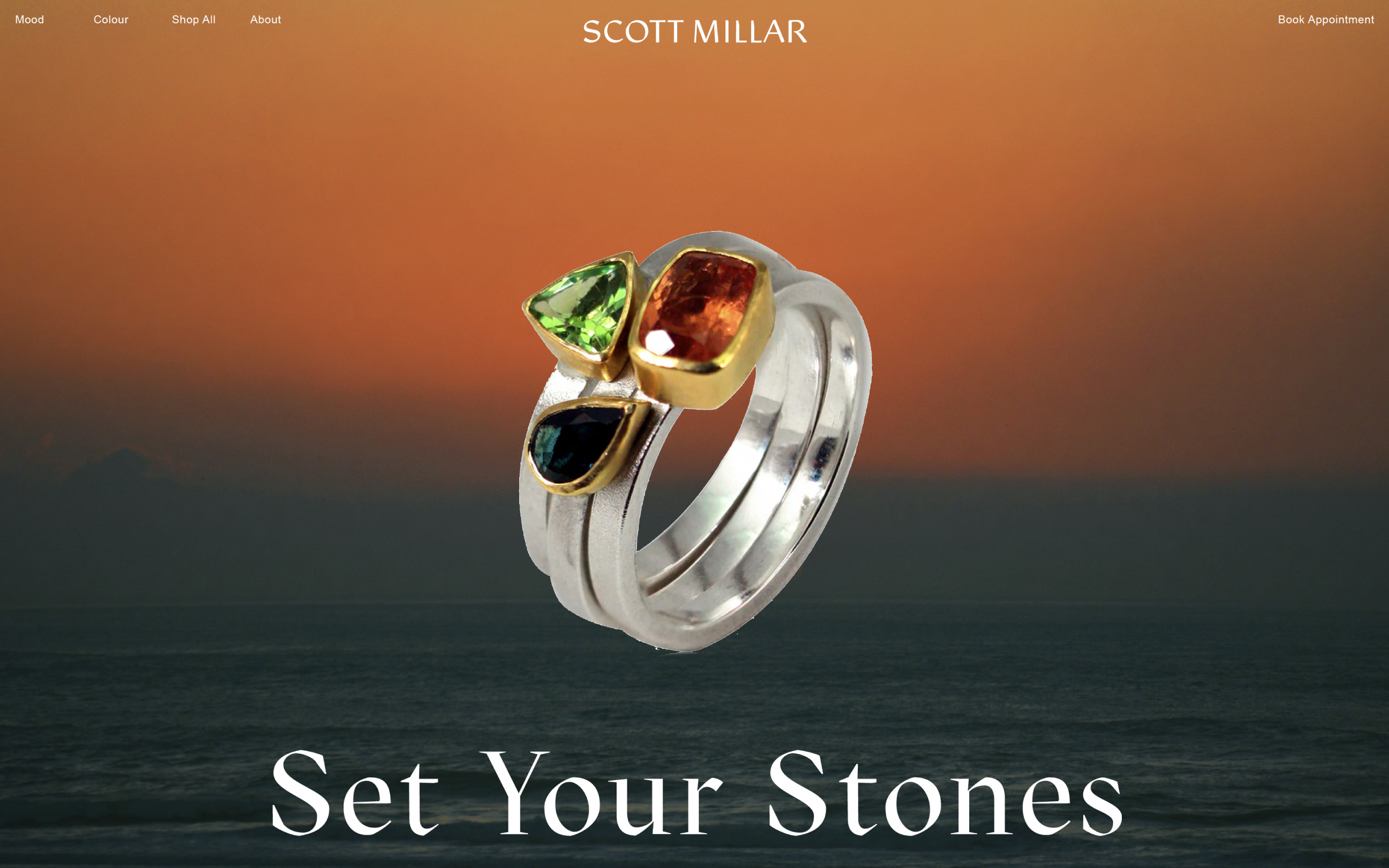
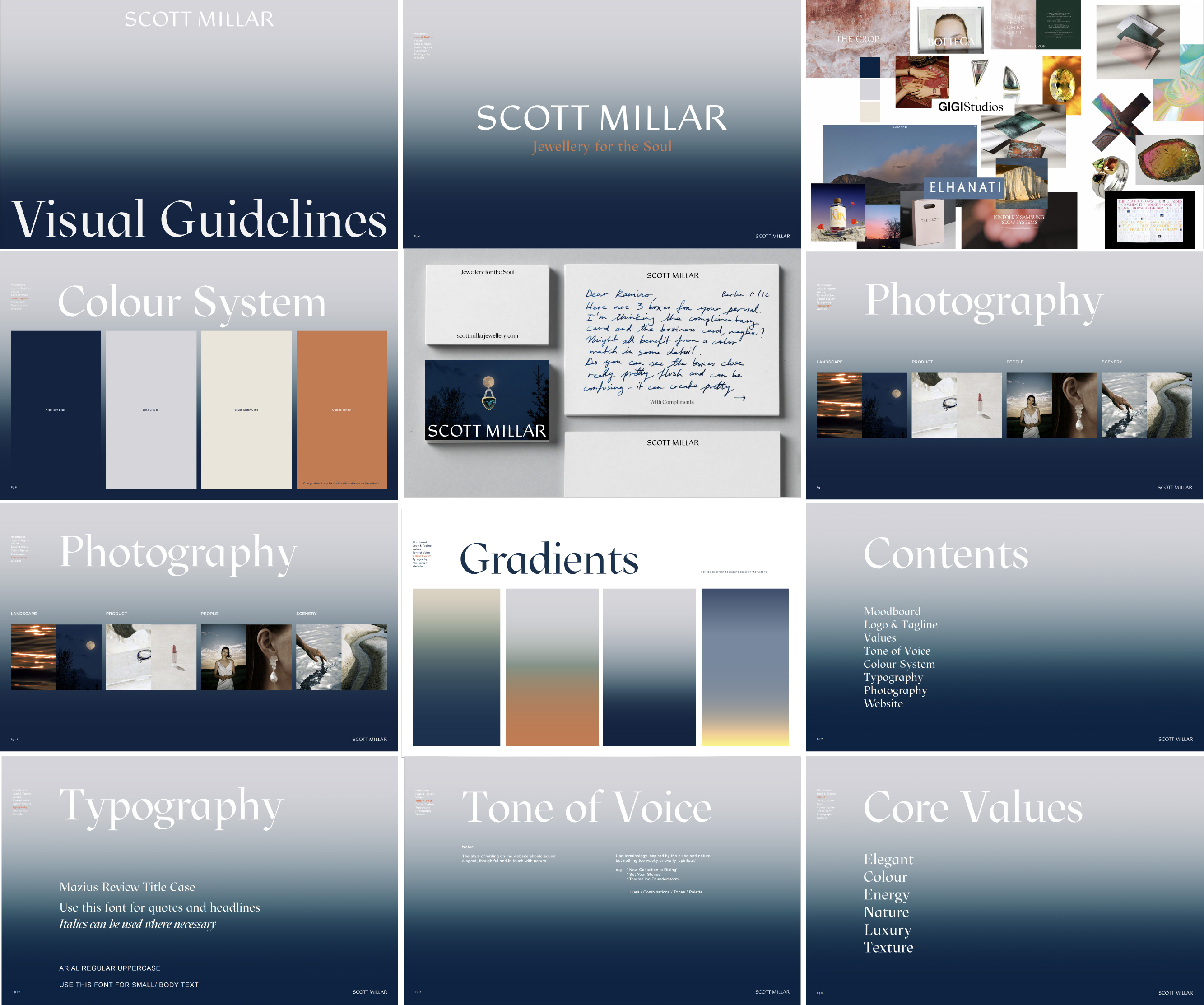
Using colour theory to guide customers with their choice of gemstones at Scott Millar.
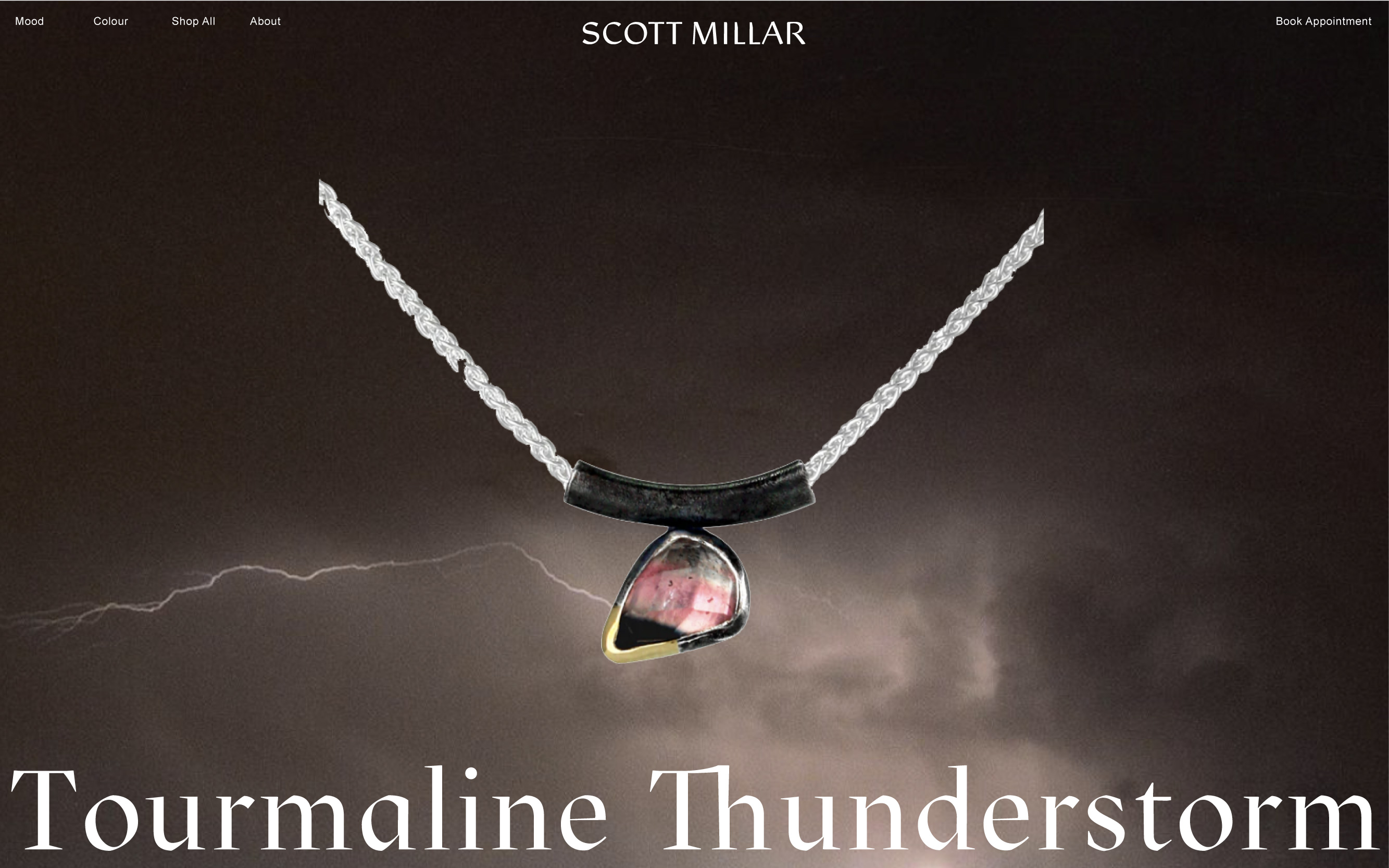
Scott’s jewellery is organic and angular in form, capturing his love affair with colour and the palette combinations inspired by the natural landscape and the rich hues of the Sussex skies.
The designs, crafted from sustainable precious stones
and recycled gold, are both raw and structural in form.
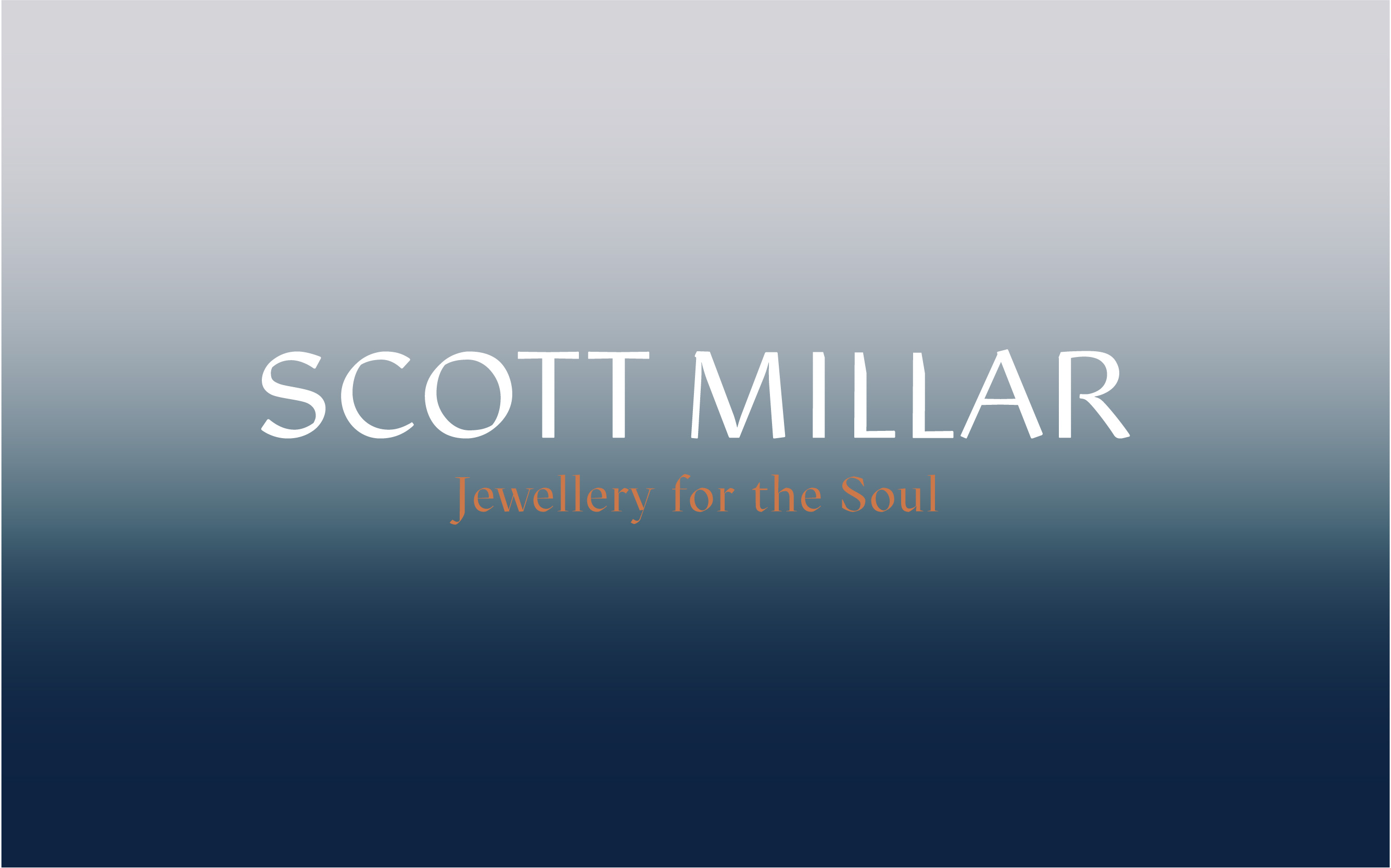
I created the visual identity, logo, tag line, colour palette, named the collection and designed the website.

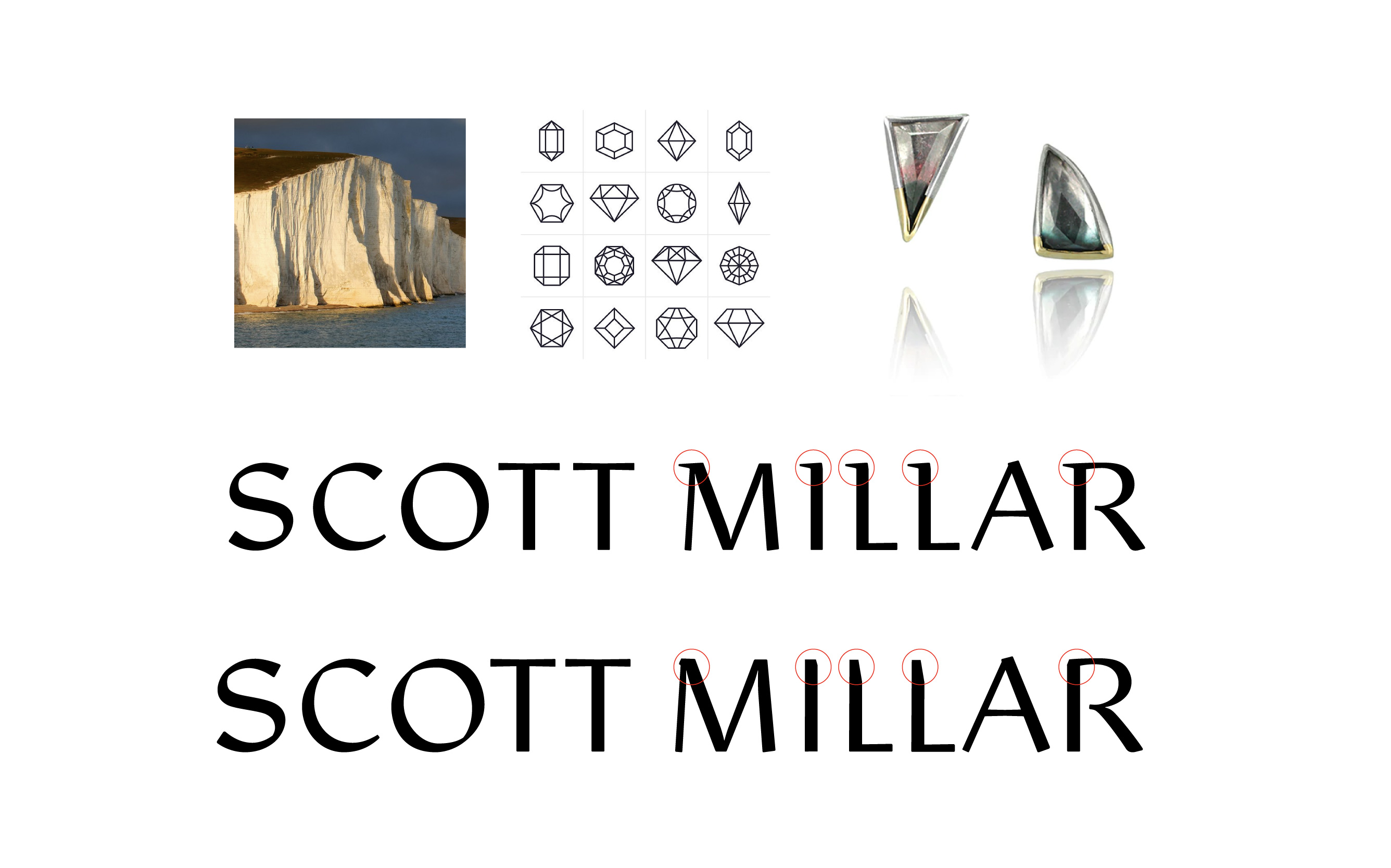
The logomark is a direct reference to Scotts tactile approach, the texture of the gemstones and the local rocky landscape, the Seven Sister Cliffs.


Call on
+44 (0) 7792 598322
Write tocharlotte@bourndesigns.com
© CHARLOTTE BOURN IS AN ARTIST & DESIGNER BASED IN BRIGHTON
Follow on
Visit Studio
18 Jew St, Brighton
Call on
+44 (0) 7792 598322
Write to
Follow onInstagram
Stay in Touch
© CHARLOTTE BOURN IS A BRIGHTON BASED ARTIST & DESIGNER
+44 (0) 7792 598322
Write to
charlotte@bourndesigns.com
Follow on
Stay in Touch
Sign Up
© CHARLOTTE BOURN IS A BRIGHTON BASED ARTIST & DESIGNER